When to Use Area Charts: Making the Most of Visualizing Trends Over Time
Learn when to choose an area chart and how to make it tell your data's story effectively.
Powerful Tools to Transform and Analyze Your Data
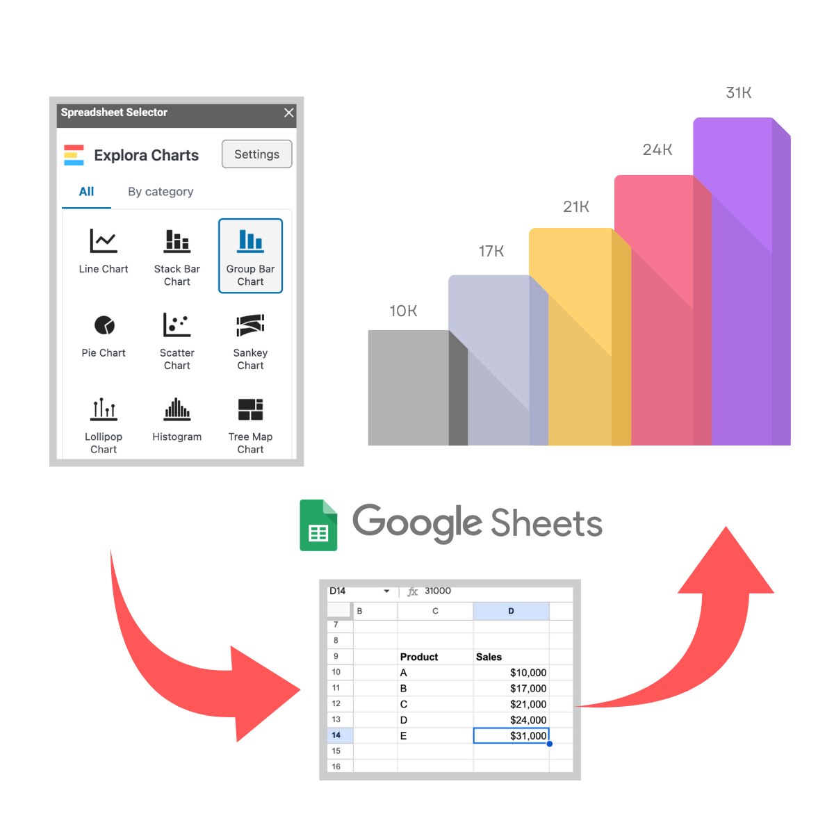
ExploraBI Charts
Easily create beautiful charts in Google Sheets™. Customize your charts to make your data clear and easy to understand.
More than 20 chart types!
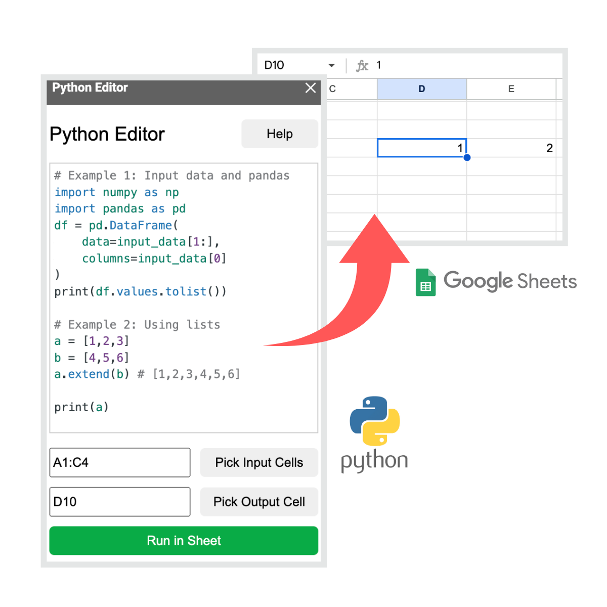
Python Editor
Use our code editor to write your code. Run your scripts and print the results in your spreadsheet. Use popular libraries like Numpy and Pandas.
This is your go-to guide for understanding data and data visualization. Each article will help you build your knowledge, making complex concepts simple and clear. Whether you’re just getting started or looking to improve your skills, you’ll find practical tips and tutorials to help you become confident in working with data visualizing it effectively.
Learn when to choose an area chart and how to make it tell your data's story effectively.
You’ll learn practical tips to select the right visual to enhance your data story.
We'll explore the art of data storytelling, focusing on how to craft compelling stories that resonate with your audience using data.
We’ll explore the power of Sankey charts, a unique type of data visualization designed to display flows or transfers between categories. Learn how to use Sankey charts to tell a compelling story by visualizing the movement of data.