· 5 min read
How to Create a Pie Chart Step-by-Step in Google Sheets with ExploraBI Charts
Master pie chart creation in Google Sheets with this comprehensive step-by-step guide. Learn basic setup, advanced customization, and professional techniques using ExploraBI Charts for stunning data visualization.

Pie charts are one of the most intuitive ways to show proportions and percentages in your data. Whether you’re displaying budget allocations, market share analysis, or survey results, creating effective pie charts in Google Sheets has never been easier.
This comprehensive tutorial will guide you through creating professional pie charts using both Google Sheets’ built-in tools and the advanced capabilities of ExploraBI Charts. You’ll learn everything from basic setup to advanced customization techniques that make your data truly shine.
Table of Contents
- Why Use a Pie Chart in Google Sheets?
- Step 1: Enter Your Data
- Step 2: Insert a Pie Chart in Google Sheets
- Step 3: Customize Your Pie Chart
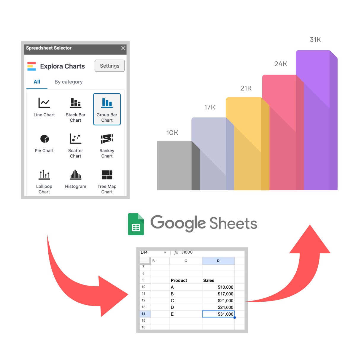
- Step 4: Make Your Pie Chart with the Explora BI Add-On
- Step 5: Share Your Pie Chart
- Best Practices for Pie Charts
- Final Thoughts
Why Use a Pie Chart in Google Sheets?
A pie chart is great when you want to highlight proportions and percentages. Here are a few examples:
- Budget allocation: Show how much of your spending goes toward housing, food, travel, etc.
- Market share: Visualize competitors’ shares of a market.
- Survey results: Display responses in an easy-to-read format.
- Resource allocation: Show how different projects or departments use company resources.
Pie charts are quick to create and very easy for audiences to understand at a glance.
Step 1: Enter Your Data
First, make sure your data is structured correctly:
| Category | Value |
|---|---|
| Rent | 1200 |
| Groceries | 450 |
| Transportation | 200 |
| Entertainment | 150 |
| Savings | 300 |
Each category should have a label in one column and its corresponding value in another.
Step 2: Insert a Pie Chart in Google Sheets
- Highlight your data (both columns).
- Go to the top menu and click Insert > Chart.
- By default, Google Sheets will create a chart.
- In the Chart editor panel on the right, change the chart type to Pie chart.
Now you have your basic pie chart!
Step 3: Customize Your Pie Chart
Google Sheets allows you to adjust your chart design. In the Customize tab of the Chart editor, you can:
- Change colors for each slice
- Add labels (percentages, values, or category names)
- Choose 2D or 3D pie chart
- Adjust the legend (position, font size, etc.)
- Add a chart title
This makes your chart easier to read and more professional.
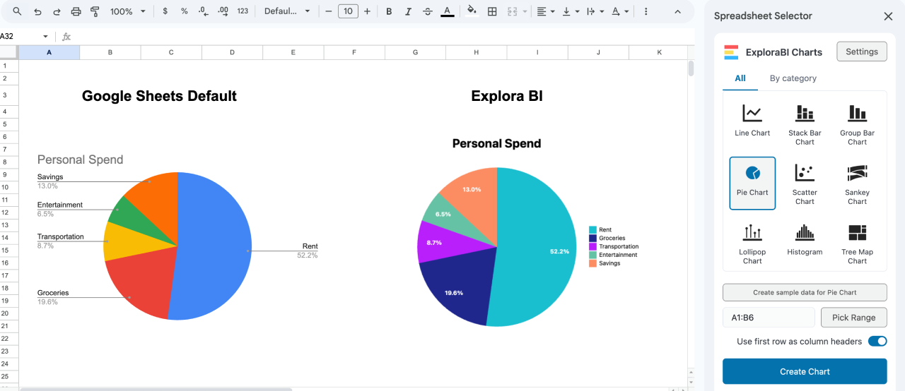
Step 4: Make Your Pie Chart with the Explora BI Add-On
While the native Google Sheets pie chart is great for simple visuals, it has limitations — especially if you want advanced styling. That’s where the Explora BI Charts Add-On comes in.
With Explora BI, you can:
- Create pie charts with advanced styling.
- Change colors, fonts, labels, etc.
- Copy your configuration if you want to reuse it later.
- Embed the chart in your spreadsheet.
- Export as an image (JPG, PNG) or as a vector image (SVG)
- Share your charts with teammates or clients in a polished format.
Here’s a quick comparison:
| Feature | Google Sheets Default | Explora BI Add-On |
|---|---|---|
| Basic Pie Chart | ✅ Yes | ✅ Yes |
| Custom Colors & Labels | ✅ Limited | ✅ Advanced |
| Sharing Options | ✅ Basic (link/embed) | ✅ Enhanced exports, sharing |
Step 5: Share Your Pie Chart
Once your chart looks good, you can share it in multiple ways:
- Copy and paste into Google Docs or Slides.
- Publish to the web directly from Google Sheets.
- Download as PNG, PDF, or SVG.
This makes it easy to include your charts in reports, presentations, or client updates.
Best Practices for Pie Charts
Before you publish, keep these tips in mind:
- Use no more than 5–6 slices for clarity.
- Highlight the most important slice with color or emphasis.
- Label slices with percentages for easy interpretation.
- Avoid using too many similar colors.
- If your data has too many categories, consider a bar chart instead.
Common Pitfalls to Avoid
When creating pie charts, watch out for these common mistakes:
- Too Many Slices: Limit to 5-6 categories for clarity
- Similar Colors: Use contrasting colors for better readability
- Missing Labels: Always include percentages or values
- Poor Data Preparation: Clean your data before charting
- Wrong Chart Type: Consider bar charts for many categories
Related Articles
Ready to explore more chart types and advanced techniques? Check out these related guides:
- Ultimate Guide to ExploraBI Charts - Discover all 20+ chart types and advanced features
- Advanced Charts in Google Sheets: Sankey, Tree Map, Heatmap, Word Cloud - Explore sophisticated visualization options
- Visual Storytelling with ExploraBI Charts - Learn to create compelling data narratives
- Exporting Charts as PNG, JPG, or SVG: Complete Walkthrough - Master professional export options
For automation that complements your charting workflow, explore ExploraBI Automation and learn how to Master Google Sheets Automation.
Final Thoughts
Creating effective pie charts in Google Sheets is a fundamental skill for anyone working with data. While Google Sheets’ built-in charts work for basic needs, ExploraBI Charts elevates your visualizations to professional standards with advanced styling, multiple export formats, and reusable configurations.
The key to great pie charts lies in proper data preparation, thoughtful design choices, and selecting the right tool for your needs. Whether you’re creating simple budget breakdowns or complex market analysis, following the techniques in this guide will ensure your charts communicate clearly and effectively.
Ready to create stunning pie charts?
Try ExploraBI Charts today and transform your Google Sheets data into professional visualizations that impress clients and stakeholders. Start with our free version to explore the basics, then upgrade to unlock the full potential of data visualization.
For detailed pricing information and feature comparisons, visit our Charts Pricing page.