· 7 min read
Ultimate Guide to ExploraBI Charts: Create Awesome Charts in Google Sheets
Discover everything you can do with ExploraBI Charts in Google Sheets. From 20+ chart types to advanced customization, export options, and professional features - your complete guide to data visualization excellence.
Google Sheets is powerful for data analysis, but its default charting capabilities can feel limiting when you need professional-quality visualizations. That’s where ExploraBI Charts transforms your spreadsheet into a data visualization powerhouse.
This ultimate guide covers everything you can do with ExploraBI Charts - from basic setup to advanced customization techniques that will make your data shine.
Table of Contents
- What is ExploraBI Charts?
- Getting Started with ExploraBI Charts
- Complete Chart Library: 20+ Chart Types
- The Minimalist Editor Interface
- Working with Sample Data
- Advanced Customization Options
- Export Options: PNG, JPG, and SVG
- Embedding and Reusing Configurations
- Professional Use Cases
- Free vs Pro Features
- Best Practices for Chart Design
- Getting the Most from ExploraBI Charts
What is ExploraBI Charts?
ExploraBI Charts is a Google Sheets add-on that extends your spreadsheet’s visualization capabilities far beyond the default options. With over 20 chart types, professional styling options, and flexible export formats, it bridges the gap between basic spreadsheet charts and expensive business intelligence tools.
Key Benefits:
- Professional Quality: Create publication-ready charts directly in Google Sheets
- Extensive Library: Access 20+ chart types including Sankey, Tree Maps, Word Clouds, and more
- Easy to Use: Intuitive interface that requires no coding or design experience
- Flexible Export: Save as PNG, JPG, or SVG for any use case
- Cost-Effective: One-time purchase vs. monthly subscriptions
Getting Started with ExploraBI Charts
Installation and Setup
Install the Add-on
- Open Google Sheets
- Go to Extensions → Add-ons → Get add-ons
- Search for “ExploraBI Charts”
- Click Install and grant permissions
Access the Interface
- Open any Google Sheet with data
- Go to Extensions → ExploraBI Charts → Open Charts
- The sidebar will appear with all chart options
Your First Chart in 3 Steps
- Select Your Data: Highlight the data range you want to visualize
- Choose Chart Type: Pick from the extensive chart library
- Customize and Export: Adjust styling and save your chart
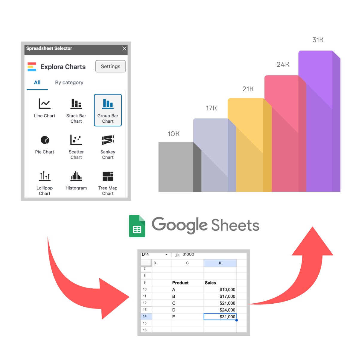
Complete Chart Library: 20+ Chart Types
ExploraBI Charts offers the most comprehensive chart library available for Google Sheets:
Basic Charts
- Bar Charts: Horizontal and vertical comparisons
- Line Charts: Trends and time-series data
- Pie Charts: Proportional data visualization
- Area Charts: Cumulative trends over time
- Scatter Plots: Correlation analysis
- Bubble Charts: Three-dimensional data relationships
Advanced Visualizations
- Sankey Diagrams: Flow and process visualization
- Tree Maps: Hierarchical data representation
- Heatmaps: Data intensity visualization
- Word Clouds: Text frequency analysis
- Radar Charts: Multi-dimensional comparisons
- Waterfall Charts: Sequential value changes
Specialized Charts
- Gantt Charts: Project timeline management
- Chord Diagrams: Relationship mapping
- Donut Charts: Enhanced pie chart variations
- Likert Scale Charts: Survey data visualization
The Minimalist Editor Interface
ExploraBI Charts features a clean, intuitive interface designed for efficiency:
Design Philosophy
- Clutter-Free: Only essential controls visible
- Context-Aware: Options change based on chart type
- Preview-First: See changes in real-time
- Professional Defaults: Charts look great out-of-the-box
Key Interface Elements
- Chart Type Selector: Quick access to all chart types
- Data Configuration: Easy range selection and series setup
- Styling Panel: Colors, fonts, and layout options
- Preview Window: Real-time chart preview
- Export Controls: Format and quality settings
Working with Sample Data
One of ExploraBI Charts’ standout features is its built-in sample data functionality:
Sample Data Benefits
- Instant Testing: Try chart types without preparing data
- Learning Tool: Understand how different data structures work
- Template Creation: Use samples as starting points
- Demonstration: Show chart capabilities to stakeholders
Available Sample Datasets
- Sales Performance: Monthly sales by region and product
- Survey Results: Customer satisfaction responses
- Financial Data: Budget allocations and expenses
- Project Timelines: Task dependencies and durations
- Market Analysis: Competitor comparisons and trends
Advanced Customization Options
Color Management
- Smart Palettes: Professionally designed color schemes
- Brand Colors: Custom color matching for corporate identity
- Accessibility: Color-blind friendly options
- Gradient Effects: Smooth color transitions
Typography Control
- Font Selection: Google Fonts integration
- Size Hierarchy: Automatic scaling for readability
- Weight Options: Bold, regular, and light variants
- Alignment: Precise text positioning
Layout Flexibility
- Responsive Design: Charts adapt to different sizes
- Margin Control: Fine-tune spacing and padding
- Legend Positioning: Multiple placement options
- Axis Customization: Scale, labels, and formatting
Export Options: PNG, JPG, and SVG
Format Selection Guide
PNG - Best for:
- Web use and digital presentations
- Charts with transparency needs
- High-quality screenshots
- Social media sharing
JPG - Ideal for:
- Print materials and reports
- Email attachments (smaller file sizes)
- Photography-style backgrounds
- General document inclusion
SVG - Perfect for:
- Scalable graphics for any size
- Web development projects
- Professional publications
- Logo and branding materials
Quality Settings
- Resolution Control: From web-optimized to print-ready
- Compression Options: Balance quality vs. file size
- Dimension Presets: Standard sizes for common uses
- Batch Export: Multiple formats simultaneously
Embedding and Reusing Configurations
Configuration Management
- Save Templates: Store chart setups for repeated use
- Quick Apply: One-click application to new data
- Version Control: Track changes and revert if needed
- Team Sharing: Distribute templates across your organization
Embedding Features
- Direct Integration: Charts embed seamlessly in sheets
- Auto-Update: Charts refresh when data changes
- Multiple Charts: Combine different visualizations
- Dashboard Creation: Build comprehensive reporting views
Professional Use Cases
Business Intelligence
- Executive Dashboards: KPI tracking and performance metrics
- Financial Reporting: Budget analysis and variance reports
- Sales Analytics: Pipeline tracking and territory performance
- Market Research: Competitive analysis and trend identification
Project Management
- Timeline Visualization: Gantt charts for project planning
- Resource Allocation: Team workload and capacity planning
- Progress Tracking: Milestone achievement and deadline monitoring
- Risk Assessment: Issue identification and impact analysis
Marketing and Communications
- Campaign Performance: ROI tracking and channel analysis
- Content Strategy: Engagement metrics and content planning
- Brand Reporting: Awareness tracking and sentiment analysis
- Social Media: Follower growth and engagement trends
Free vs Pro Features
Free Version Includes
- 5 Chart Types: Essential visualizations for basic needs
- Standard Export: PNG format at web resolution
- Basic Customization: Colors and simple styling
- Sample Data: Access to demonstration datasets
Pro Version Unlocks
- 20+ Chart Types: Complete visualization library
- All Export Formats: PNG, JPG, and SVG at any resolution
- Advanced Customization: Full styling and branding control
- Configuration Saving: Template creation and reuse
- Priority Support: Faster response to questions and issues
Upgrade Decision Factors
- Chart Variety Needs: Do you need specialized visualizations?
- Export Requirements: Do you need print quality or SVG formats?
- Brand Consistency: Do you need custom styling options?
- Workflow Efficiency: Would saved configurations save time?
Link to detailed pricing comparison: ExploraBI Charts Pricing
Best Practices for Chart Design
Data Preparation
- Clean Your Data: Remove empty cells and inconsistencies
- Structure Properly: Organize data with clear headers
- Choose Appropriate Ranges: Select relevant data only
- Consider Scale: Ensure data ranges are meaningful
Visual Design Principles
- Simplicity First: Avoid unnecessary elements
- Color with Purpose: Use colors to highlight key information
- Readable Typography: Choose legible fonts and sizes
- Consistent Styling: Maintain visual harmony across charts
Chart Type Selection
- Bar Charts: For comparing categories
- Line Charts: For showing trends over time
- Pie Charts: For showing parts of a whole (limit to 5-6 slices)
- Scatter Plots: For showing relationships between variables
Getting the Most from ExploraBI Charts
Workflow Optimization
- Start with Sample Data: Understand chart capabilities
- Create Templates: Save configurations for repeated use
- Batch Processing: Export multiple formats simultaneously
- Regular Updates: Keep charts current with data changes
Integration Strategies
- Dashboard Creation: Combine multiple charts in one view
- Report Automation: Link charts to regularly updated data
- Presentation Ready: Export formats suitable for any medium
- Team Collaboration: Share configurations and best practices
Learning Resources
- Tutorial Library: Step-by-step guides for each chart type
- Best Practices: Design principles and data visualization tips
- Use Case Studies: Real-world applications and examples
- Community Support: User forums and knowledge sharing
Related Articles
Ready to dive deeper into specific chart types and techniques? Explore these detailed tutorials:
- How to Create a Pie Chart Step-by-Step in Google Sheets with ExploraBI Charts - Master the fundamentals with our most popular chart type
- Advanced Charts in Google Sheets: Sankey, Tree Map, Heatmap, Word Cloud - Explore sophisticated visualization techniques
- Exporting Charts as PNG, JPG, or SVG: Complete Walkthrough - Master all export formats and quality settings
- Visual Storytelling with ExploraBI Charts - Learn to create compelling data narratives
For automation workflows that complement your charting, check out ExploraBI Automation and the Automation Tutorial.
Final Thoughts
ExploraBI Charts transforms Google Sheets from a basic spreadsheet tool into a professional data visualization platform. Whether you’re creating simple pie charts or complex Sankey diagrams, the combination of extensive chart types, intuitive design, and flexible export options makes it the ideal solution for anyone serious about data presentation.
The minimalist interface ensures you can focus on your data story rather than wrestling with complicated controls, while the professional output quality means your charts are ready for any presentation or publication.
Ready to elevate your Google Sheets visualizations?
Try ExploraBI Charts today and discover how easy it is to create stunning, professional charts that make your data shine. Start with the free version to explore the basics, then upgrade to Pro when you’re ready to unlock the full potential of data visualization in Google Sheets.